This interesting paper was published in Comprehensive Urban Study (sogo toshi kenkyuu) in 1978. Its two parts (one written in 1972 and the other in 1977) talk about the recent expansion of Tokyo, specifically to do with its increasing suburbanisation. It features some great maps of which I feature some in this post.
Decomposing the population change in the Tokyo Metropolis between 23 wards and the rest as well as natural and social increase/decrease
The author, Yoshio Watanabe, describes Tokyo’s “giant city growth”: Crucial time markers are the mid-1950s, when the idea to look at the city’s growth analytically gained prominence. The Olympic moment in the early 1960s put the focus on some of the negative effects of this growth, environmental and social.
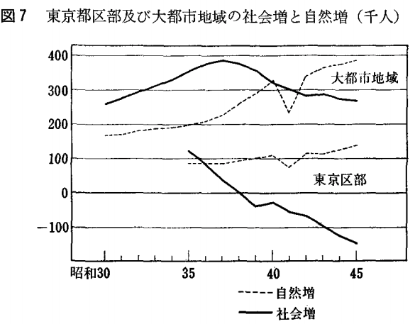
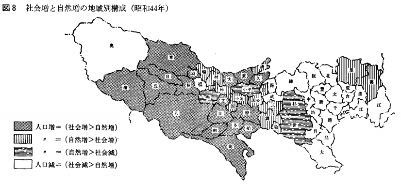
The first charts on page 61 show that Tokyo’s population growth increasingly took place outside the 23 wards. I wrote about the implications for density figures before. The maps on the ensuing page show this in geographical detail. The growth poles moved further out west in the fifteen years between 1955 and 1970.
This is a representative graph from the publication on page 64. It shows the population dynamics for Tokyo’s ku, shi and machi categories. We see that most of the 23 wards shed population in 1969. Their social loss (shakai gen), or net out-migration, is bigger than the natural increase (shizen zo).
Tokyo’s population growth took place in the Western suburbs (or in the neighbouring prefectures, which are not part of this analysis). Here, most of the growth is accounted for by social increase, or net in-migration. Part of this inflow comes from outside of Tokyo, and part of it from within.
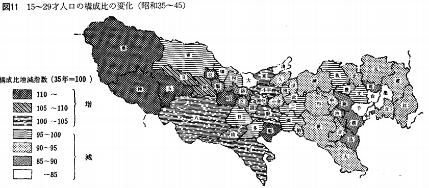
This population change has an impact on the age structure. Here (see map above from page 65), we see that the ward area grows increasingly old during the 1960s. The proportion of the population between 15-29 years old decreases substantially in the central business wards. Young families were increasingly priced out of the city, a story told beautifully by Azuma-tei in Gaien-mae.

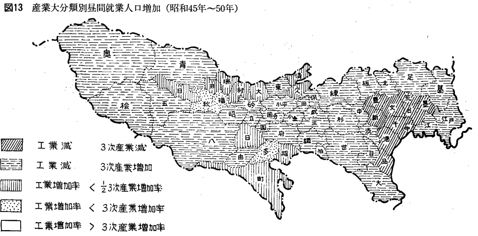
A fantastic map on page 67 shows the increase or decrease of economic activity by sector from 1965 to 1970.
Some of the major industrial wards such as Ota and Sumida see their industrial employment decrease, while the tertiary sector increases its share. The growth in the industrial sector employment is less than half that of the tertiary sector in most other wards. The penultimate category shows industrial employment growth below that of the tertiary sector.
The fourth category shows the districts in which industrial employment growth outstrips that of the tertiary sector. This is the relocation of heavy industries from Tokyo’s central wards to more outer areas in practice.
This trend intensifies from 1970-1975 (page 81). Tertiary employment growth (as measured by working hours I presume) is now stronger than industrial growth everywhere within the Tokyo metropolis. There are very few areas in which there is industrial growth to begin with, and mostly it’s less than half of that of the tertiary sector.
The chart is interesting in that it shows an actual decrease in hours worked not just in industry but also in the tertiary sector in the central wards. As there is overall growth in the number of people employed in e.g. Chiyoda, the only explanation of this is that there is a reduction in average hours worked. I’ll dig a little deeper into this.

Suburbanisation brings with it much longer commutes, as this map from page 67 shows. The biggest increases in this commuter index between 1965 and 1970 occur in the newly urbanising suburbs. However, no overall pattern emerges and there are some surprises.
Some of the industrial growth areas, e.g. Kodaira and Tachikawa lower their average commute during this period, i.e. employment is predominantly local. This book by Gary Allinson (1979) describes this process for two of Tokyo’s suburbs. Meanwhile, Machida, sees a strong concurrent increase in its commuting share. Ota, Nerima and some other “newer” central wards, witness only very little growth in commutes.
The exorbitant increases in the commuter index of the central business wards suggest it is not just the “sending” but also the “receiving” end of the commute that goes into the index’s calculation.
The next maps on page 68 show that it is by no means just a story of commuting towards Tokyo’s central business wards. In fact, the destinations receiving most of the increases in commuters from Suginami-ku and Koganai-shi are nearby ku and shi. Tokyo’s development is polycentric. The excellent transportation system ensures the sourcing of labour from a relatively large radius.

This map on page 69 shows the share of the three central wards (Chou, Chiyoda and Minato) in terms of commuters’ destination of all other administrative divisions. Some of the neighbouring ku send more than 45% of their commuters to these three wards (e.g. Bunkyo). The further away we go, the less important do they become.
Some surprises are the heavy concentration of commuters (30-39%) commuting to the three central wards in places as far away as Kokubunji. This is at least in part explained by good transportation links, in this case the Chuo Line. Remarkable that even in a place as far away as Ome (50 kilometers from Tokyo Station), more than 5% of commuters travelled to the central wards each day.
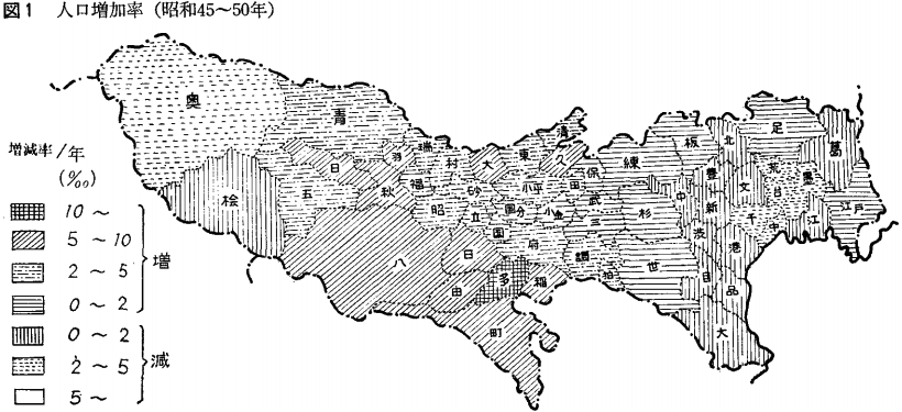
The next section of the report takes up some of the themes and adds to the 1973 body with information published after that. The chart above shows the annual population growth / decrease between 1970 and 1975.
One outlier is Tama, with more than 10% annual growth. This is explained by the large public housing developments that were finished in this time period.
Meanwhile the population decreased in the central wards of Tokyo and increased everywhere else. A major exception to this is the western-most and predominantly rural Okutama. Population decline here mirrors that of almost all agricultural regions in Japan.
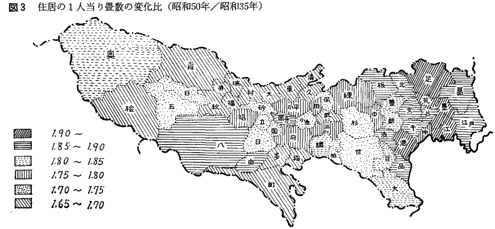
The chart above (page 77) shows the factor increase in tatami area per person between 1960 and 1975.
As one may guess, the central and formerly very densely populated wards see the biggest increase in average living space per person, approaching factor 2, mainly as the population has thinned out without the corresponding loss in square footage of housing space. However, the increase in living space per capita is universal. The quality and quantity of housing increase massively in this period.
Great report, with fascinating data that will no doubt inspire my research.
