I wanted to share and briefly discuss a great graph on income inequalities in Tokyo and Osaka that I found. It has been compiled by the NLI Research Institute and shows interesting variations across the 23 wards.

Click for original
The left-hand side of the graph shows Tokyo’s 23 wards, to the right we see the equivalent information from Osaka. Besides Gini coefficients, we can also see the distribution of household incomes. All in all, a really well-produced. information-packed graph.
The Gini coefficients have a surprisingly wide range but seemingly no strong correlation with the distribution of household incomes. Given that the report is written by a real estate specialist, homeownership and the effect of lower household incomes on condominium sales prices (via lower rental prices) are being discussed briefly.
Anyway, the lowest income inequality (as measured by Gini, that is) is calculated for Edogawa (0.36), the highest for Shibuya (0.44). The same minimum and maximum are to be found in Osaka, so from that cursory glance Tokyo does not appear to be an outlier.
It would be great to see more analysis on this and try and find some explanations for the large variations in inequality. This is data from 2013, and building this for prior years is time consuming and hard for the pre-digital age given the large amounts of data that need to be computed.
My two cents would be that Tokyo’s overall inequality measure (0.41) has gone up in line with national developments and that the spatial differentiation between the wards has likewise increased.
While the former is probably common sense, the latter statement is a little speculative and needs some further analysis. Doing that could help in supporting my claim that the Tokyo between 1945-1970 was egalitarian (by today’s standards, at least!).
One further link for the record here is to a story on Arakawa City’s “Gross Arakawa Happiness” initiative. The eastern ward with relatively low income inequalities has made an effort to measure the welfare of its citizens beyond GDP.
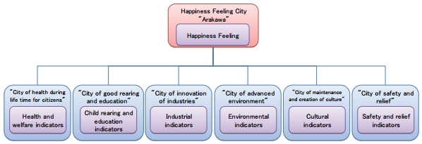
It looks like an interesting composite index with a variety of subcomponents. It is always interesting to see what people come up with in their quest for measuring seemingly immeasurable things.
Further community wellbeing indicators from Japan are discussed here.
