Below see some interesting tables I have found in a recent research report and of which I want a record, and why not on this blog? They are about Tokyo’s population distribution in and outside of the 23 wards. Nothing earth-shattering, but some ideas on how to present data at the very least. An interesting graph on land price increases concludes this post.
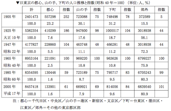
Tokyo’s historical population distribution is neatly summed up in this report by the Research Institute for High-Life (p. 27). Over a 100-year period it shows the percentage of the population that has lived in the city centre (second column, Chiyoda and Chuo wards), followed by the proportion in the Yamanote area (fourth column, defined as Minato, Shinjuku and Bunkyo wards), the “downtown” area (sixth column, today’s Taito, Sumida and Koto wards) and the “suburbs” (eighth column, all other wards). Today, 81% of the 23 wards’ population lives in the latter category, up from a mere 16% a hundred years ago. Concurrently, the share of the population in Chuo and Chiyoda is down to under 2% of the 23 wards’ population in 2005, compared to 23% in 1905. Meanwhile the absolute population in the shitamachi and yamanote area has stayed remarkably stable.
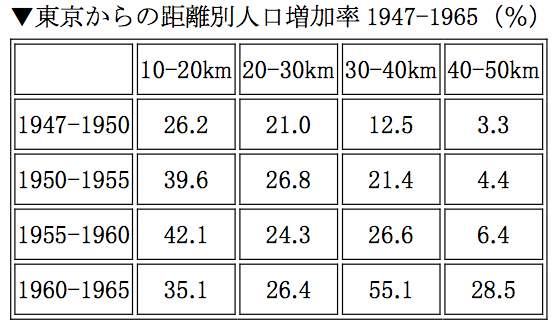
From the same source is the graph above (p. 32). It shows the population growth rate in (3-) 5-year intervals in concentric zones of increasing distance from Tokyo’s centre between 1947 and 1965. The fastest population growth took place in the 10 and 20 kilometer radius in the first three periods. Population growth gradually increased in the more distant zones as time went by. In the 1960-65 period, the fastest growth took place in the zone delineated by the 30-40 kilometer radii. This shows that while suburbanization became more important, the immediate postwar period saw the fastest growth occur relatively close to the centre, i.e. in the outer 23 wards as well as in the Tama area.
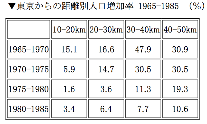
For completeness’ sake, herewith the same table from 1965 onwards. We see a general growth slowdown as urbanization runs its course towards the end of the observation period, i.e. 1985. Growth is now distributed the other way around: the proportionately biggest population increase occurs far outside of the centre, between the 30-40 kilometer radii and even beyond. This is suburbanization.
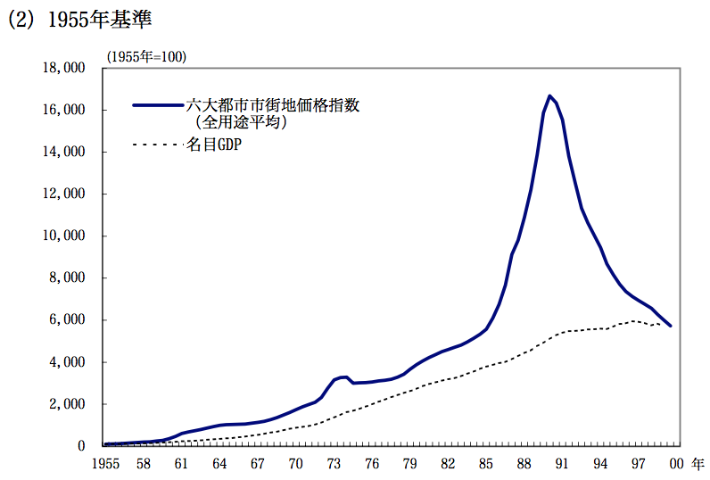
And finally, the graph above is from a Bank of Japan research note on land price developments. The chart in Annex 2 shows how GDP and land prices have developed until 2000, with 1955 being the base year. We see the first eclipse, i.e. land price increases being much higher than increases in GDP, taking place in the early 1960s. A second bump occurs just before the first oil shock, in what was an unusually inflationary period. The big message of course is the period after the Plaza Accord, i.e. ultra-low interest rates and the speculative boom that would culminate in the lost decades following the 1989/1990 crash. I will keep looking for Tokyo data, and better even, historical land price data for the 23 wards.
